Tech@Streethub logo

JS: front/back, desktop/mobile

Redesigning the StreetHub invite

Not just a facelift

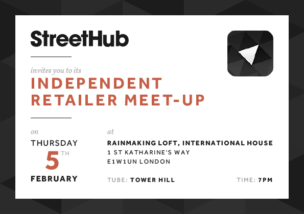
Here's the invite of our previous retailer event:
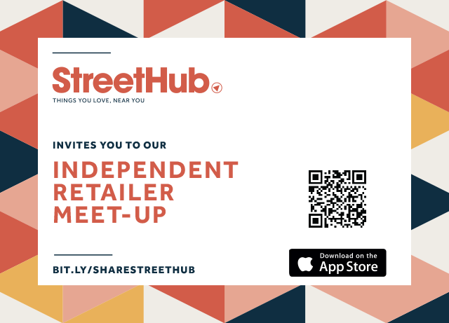
StreetHub invite v1 front
StreetHub invite v1 back

It's already pretty good, but what would you improve?

We have another event coming up next month, so I was asked to rework on the invite. It needed a facelift, but I thought I could also improve the layout a bit.

Identifying the issues

StreetHub invite v1
The logo doesn't need the arrow nor the tagline anymore.
StreetHub invite v1
There is a bit.ly link whose context doesn't provide any indication about its target.
StreetHub invite v1
What is the QR code for? The event? The website? Something else? And what app is exactly available on the App Store?
StreetHub invite v1
The essential questions "when" and "where" are only answered on the back, and the information lacks hierarchy.
StreetHub invite v1
The main description is not very enticing, and blends the "why" and "who" together.
StreetHub invite v1
The only real call-to-action doesn't stand out, especially since it uses the same font color and style as the main text.

Fixing the issues

StreetHub invite v2
A simpler version of the logo.
StreetHub invite v2
More depth on the title, by putting the label in grey and the event name in red.
StreetHub invite v2
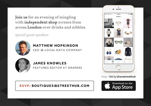
The date uses 3 colors, 2 weights, 3 sizes, and resembles a calendar entry.
StreetHub invite v2
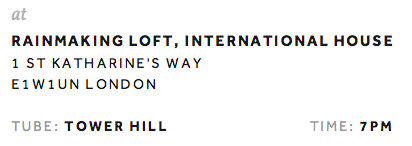
The address has now some hierarchy, to deliver the information gradually.
StreetHub invite v2
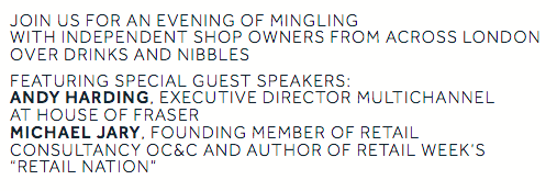
The description is more readable and visually friendlier.
StreetHub invite v2
The speakers list now includes pictures to be more identifiable.
StreetHub invite v2
The RSVP call-to-action is more prominent, and includes the red dominant color.
StreetHub invite v2
The 1/3 right part of the back promotes the app. Both the bit.ly link and the App Store button now have meaning considering the context includes a screenshot of the app.

Voilà !

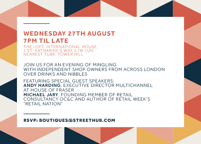
StreetHub invite v2 front
StreetHub invite v2 back
(click/tap for the pdf version)

What the rebranding accounts for is an additional font (Vollkorn), fewer colors, more shades of grey, and a dominant color.

Updating the graphics and typography is rather quick, and redesigning obviously entails more than visual updates.

I believe it makes sense for an event to provide all these basic informations on the front of the invite. There is still enough secondary information to fill up the back.

And when just using text, the 3 most basic ways to add depth is by playing with the weight, the color, and the size.

Overall, the improvements didn't require much. It's just common sense but it can go a long way.

Visit streethub.com